Introduction
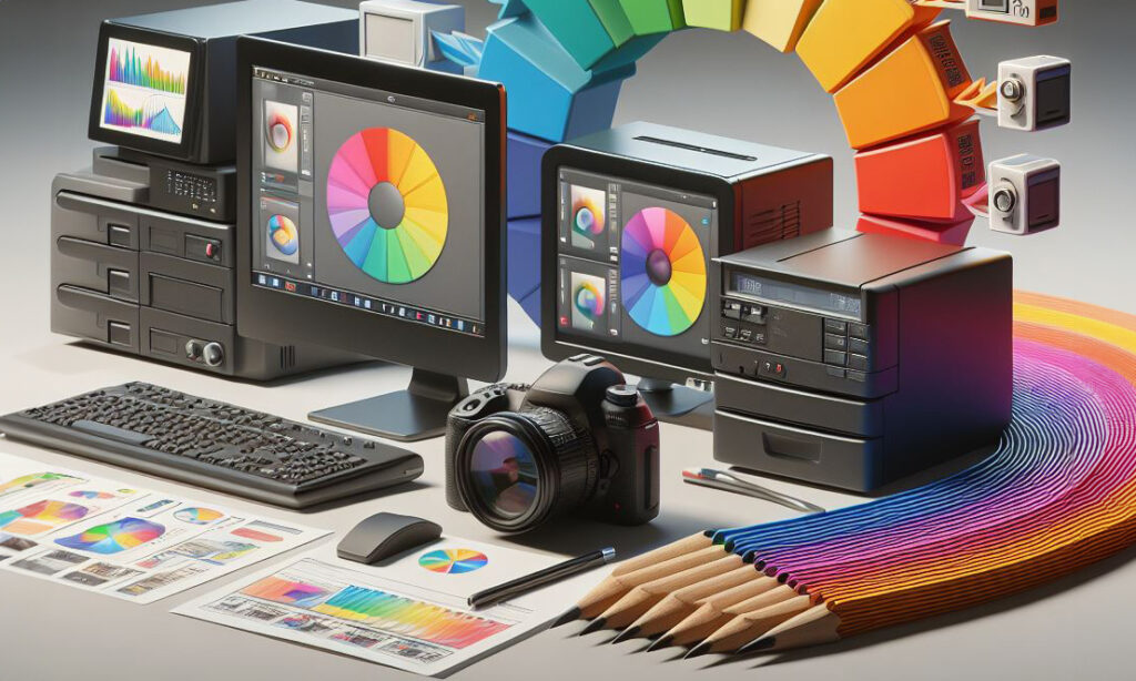
Fine art printing is a meticulous craft that demands an intricate blend of various elements, from material selection to colour calibration, ICC profiles, paper choices, and a seamless workflow. In this exploration, we will unravel the essential components that contribute to the precision in colour, with a particular focus on the crucial role of ICC profiles in fine art printing.
Material Selection
Fine art printing begins with meticulous material selection, encompassing choices for paper, ink, and substrates. These materials form the foundation on which the artist’s vision will be brought to life. Archival-quality inks, carefully chosen substrates, and the right combination of materials set the stage for the visual journey that follows.
Ink Selection
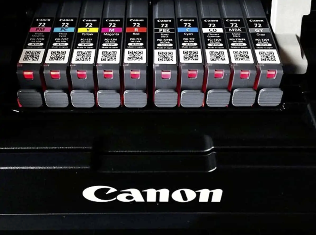
Selecting the right ink for fine art printing is a critical decision that significantly influences the quality, longevity, and aesthetic appeal of the final print. Several factors come into play when choosing ink for fine art printing, and each ink type has its own set of characteristics. Let’s explore the common types of inks used in fine art printing and the reasons behind their selection.
Pigment Inks:
Pigment inks are known for their exceptional colour vibrancy and longevity. These inks use solid pigment particles that are suspended in a liquid carrier. The result is prints with vivid colours that resist fading over time, making them ideal for archival purposes.
Pigment inks provide superior fade resistance, ensuring that fine art prints maintain their original colours for extended periods. This is particularly crucial for artists and photographers seeking prints that withstand the test of time.
Dye Inks:
Dye inks are valued for their ability to produce intensely saturated colours. These inks are made of liquid colorants that are absorbed into the printing medium. The result is prints with rich and vibrant hues, making them suitable for certain artistic expressions where colour intensity is a priority.
Dye inks are often more cost-effective than pigment inks, making them a practical choice for artists or photographers with budget considerations. However, it’s essential to note that dye prints may be more susceptible to fading over time.
UV-resistant inks:
For fine art prints intended for exterior display or environments with exposure to direct sunlight, UV-resistant inks are a suitable choice. These inks are formulated to withstand the harmful effects of UV rays, preventing premature fading and ensuring the longevity of the print.
Outdoor Art Installations:
Artists creating outdoor installations or large-scale prints benefit from UV-resistant inks, as they provide enhanced durability in challenging environmental conditions.
Archival Inks:
Archival inks are specifically designed for long-term preservation of fine art prints. These inks adhere to strict standards of lightfastness and permanence, ensuring that prints maintain their quality for generations.
Museum-Quality Prints:
Artists and photographers seeking to create museum-quality prints often opt for archival inks, as they meet the stringent requirements for archival standards.
Eco-Solvent Inks:
Eco-solvent inks are versatile inks suitable for both indoor and outdoor applications. They are designed to adhere well to a variety of materials, including vinyl and canvas. These inks emit fewer volatile organic compounds (VOCs), making them a more environmentally friendly option.
Eco-solvent inks offer durability and versatility, making them a preferred choice for artists and printmakers engaged in producing a wide range of prints for different purposes.
Acid-Free Inks:
Acid-free inks are formulated to be non-reactive and do not contribute to the degradation of the paper over time. These inks are suitable for artists who prioritise the preservation of the paper substrate, ensuring that the print remains in pristine condition.
When creating reproductions of traditional artworks or illustrations, acid-free inks are a wise choice to ensure the longevity of the print without compromising the integrity of the original medium.
Considerations When Selecting Inks for Fine Art Printing
Print Longevity: Consider the intended lifespan of the print and choose inks that align with your longevity requirements.
Colour Accuracy: Evaluate the colour accuracy and vibrancy offered by different ink types to match your artistic vision.
Application: Tailor your ink choice to the specific requirements of the application, whether it’s fine art reproduction, outdoor displays, or textile printing.
Budget: Consider the cost implications of different inks and balance quality with budget constraints.
Environmental Impact: For artists conscious of environmental impact, consider inks with eco-friendly formulations and low VOC emissions.
Printing Substrate: Ensure compatibility with the chosen printing substrate, whether it’s fine art paper, canvas, textiles, or other materials.
The choice of ink for fine art printing is a nuanced decision that depends on the specific needs of the artist or printmaker. Whether prioritising colour vibrancy, longevity, or environmental considerations, selecting the right ink is a crucial step in achieving longevity in your fine art prints.
Fine Art Paper Selection

Selecting the correct fine art paper for digital photography is a thoughtful process that involves considering various factors to enhance the visual impact and longevity of the prints. Here’s a methodology to guide you through the decision-making process:
Define Your Artistic Vision:
Understand Your Style: Consider the visual style and aesthetic you want to convey in your photography. Whether it’s vibrant landscapes, detailed portraits, or abstract compositions, your artistic vision will guide the choice of paper.
Consider Image Characteristics:
Contrast and Dynamic Range: Assess the contrast and dynamic range in your photographs. Some papers may enhance contrast, while others could be better suited for preserving subtle tonal gradations.
Understand Paper Types:
Matte vs. Glossy: Matte papers offer a non-reflective surface, making them ideal for soft and subtle images. Glossy papers, on the other hand, enhance vibrancy and detail, making them suitable for images with bold colours and high contrast.
Weight and Thickness:
Choose Appropriate Weight: Consider the weight of the paper, usually measured in grams per square meter (gsm). Heavier weights provide a more substantial feel and are often preferred for larger prints or those intended for framing.
Surface Texture:
Smooth vs. Textured: Decide on the level of surface texture that complements your images. Smooth papers work well for detailed photographs, while textured papers add a tactile element and may suit certain styles, like fine art or portrait photography.
Consider Archival Quality:
Archival Papers: If longevity is a priority, opt for archival-quality papers that resist fading and deterioration over time. Look for terms like “acid-free” and “archival” when exploring paper options.
Colour Reproduction:
Colour Saturation: Consider the colour saturation of your images. Some papers enhance colour vibrancy, while others may provide a more muted and subdued colour palette.
Printing Technology:
Compatibility: Ensure that the chosen paper is compatible with your printing technology, whether it’s an inkjet or laser printer. Some papers are specifically designed for certain printing methods.
Test Prints:
Print Samples: Before committing to a specific paper, conduct test prints. Many paper manufacturers offer sample packs that allow you to evaluate different types and make an informed decision based on actual prints.
Evaluate Lighting Conditions:
Consider Viewing Environment: Think about the typical lighting conditions in which your prints will be viewed. Some papers perform better under specific lighting, and this consideration can impact the perceived quality of your images.
Budget Considerations:
Balance Quality and Budget: Fine art papers come in a range of prices. Balance the desired quality with your budget constraints, and explore options that offer the best compromise for your specific needs.
Paper Manufacturer’s Recommendations:
Follow Guidelines: Pay attention to the recommendations provided by the paper manufacturer. They often offer insights into the intended use, printing techniques, and best practices for each type of paper.
Read Reviews and Seek Expert Advice:
Research and Consult: Read reviews from other photographers and artists who have used the papers you are considering. Seeking advice from experts or online communities can provide valuable insights into real-world experiences.
Consider Project Requirements:
Project-Specific Needs: If your prints are part of a specific project or exhibition, consider any project-specific requirements that may influence your choice of paper.
Environmental Considerations:
Eco-Friendly Options: If environmental sustainability is important to you, explore papers that are produced using eco-friendly practices and materials.
Handling and Framing:
Consider End Use: Think about how the prints will be handled and displayed. Some papers may be more resistant to fingerprints, while others are specifically designed for framing without glare.
Colour Calibration for Fine Art Printing

Colour calibration is a meticulous process that involves attention to detail and a commitment to achieving consistency across the entire workflow. By following a systematic methodology, artists and printmakers can ensure that the colours in their fine art prints accurately reflect their creative vision and maintain consistency from capture to display.
Importance of Colour Calibration:
Colour Consistency Across Devices: Colour calibration ensures that the colours captured by the camera, displayed on the monitor, and printed by the printer are consistent. This consistency is crucial for achieving accurate and faithful reproductions of your images.
Colour Preserving Artist’s Intent:
Calibration helps preserve the artist’s original vision by ensuring that the colours seen on the monitor closely match the colours in the final print. This is essential for maintaining the intended mood and impact of the artwork.
Colour Optimal Colour Accuracy:
Fine art printing often involves a nuanced and rich colour palette. Calibration helps in achieving optimal colour accuracy, allowing the subtle tones and details in the images to be faithfully reproduced in the final prints.
Colour Reducing Iterations:
Proper calibration reduces the need for extensive colour corrections and iterations during the printing process. This not only saves time but also minimises the risk of errors and inconsistencies.
Colour Calibration of a Digital Camera: Methodology

Digital camera colour calibration is of paramount importance as it ensures the faithful reproduction of colours in captured images, preserving the photographer’s artistic intent and delivering accurate and visually compelling results. By calibrating a digital camera, photographers can achieve consistency in colour representation across various shooting conditions, lighting environments, and post-processing stages.
This meticulous calibration process allows for precise adjustments to white balance, color temperature, and colour profiles, ensuring that the hues and tones in the final images closely match the true colours observed during the photo shoot. Ultimately, digital camera colour calibration serves as the foundation for producing high-quality, professional-grade photographs, fostering a reliable and standardised workflow in the realm of fine art photography and visual storytelling.
Understand the Basics:
Familiarise yourself with key concepts such as colour temperature, white balance, and colour spaces.
Shoot in RAW:
Whenever possible, shoot in RAW format for more colour information and greater flexibility during post processing.
Use a Colour Checker:
Invest in a colour checker or colour calibration card for a known reference point during post processing.
Set Custom White Balance:
Manually set the white balance using a neutral grey card or colour checker for accurate colours.
Shoot Under Consistent Lighting:
Capture images under consistent and controlled lighting conditions to minimise colour shifts.
Create Custom Camera Profiles:
Generate custom camera profiles using calibration software and a colour calibration target.
Test and Verify:
Capture scenes with different colours and tones to test your camera’s colour accuracy.
Use Neutral Colour Settings:
Set your camera’s colour settings to a neutral or standard profile for accurate colour adjustments in post processing.
Calibrate Regularly:
Regularly revisit and recalibrate your camera, especially if you notice shifts in colour accuracy.
Post Processing Adjustment:
Utilise post processing software for additional colour adjustments and enhancements.
Compare with Real world Colours:
Regularly compare digital images with real world colours to ensure consistent accuracy.

By following these steps using the Datacolor Spyder, photographers and graphic designers can ensure that their monitors display accurate and consistent colours, providing a reliable foundation for precise image editing and a more faithful representation of digital content
Install Spyder Software:
Begin by installing the Datacolor Spyder software on your computer.
Connect the Spyder Device:
Plug the Datacolor Spyder device into a USB port on your computer.
Position the Spyder:
Place the Spyder device on your monitor, ensuring it is securely attached and positioned in the centre.
Launch the Calibration Software:
Open the Spyder software and follow the onscreen instructions to start the calibration process.
Select Calibration Settings:
Choose your preferred calibration settings, including white point, gamma, and brightness. The software may provide recommended settings based on your monitor type.
Adjust Monitor Controls:
Make any necessary adjustments to your monitor’s controls (brightness, contrast, etc.) based on the calibration software’s guidance.
Initiate Calibration:
Start the calibration process through the software, allowing the Spyder device to measure and analyse the colours displayed on your monitor.
Monitor Profiling:
The Spyder software generates a monitor profile based on the collected data, creating a custom colour profile for your specific monitor.
Save Profile:
Save the generated monitor profile. This profile will be used by your operating system to ensure accurate colour representation.
Check Calibration Results:
Review the calibration results and compare them to any before and after images provided by the software. Ensure that the colours appear more accurate and consistent.
Repeat Calibration Periodically:
Regularly recalibrate your monitor, especially if you notice changes in colour accuracy or if there are significant environmental changes in your workspace.
Utilise Advanced Settings (Optional):
For users with specific preferences or advanced knowledge, explore additional settings in the Spyder software for further customisation of the calibration process.
Consider Ambient Light Compensation (Optional):
Some Spyder models offer ambient light sensors. If available, consider utilising this feature for additional adjustments based on the ambient lighting conditions in your workspace.
Follow Software Guidance:
Throughout the process, follow any guidance or recommendations provided by the Spyder software for optimal results.
Printer Colour Calibration - Datacolor Spyder Print

By following this methodology with the Datacolor Spyder Print, users can ensure that their printers are accurately calibrated for colour reproduction, resulting in highquality and consistent fine art prints.
Install Spyder Print Software:
Begin by installing the Datacolor Spyder Print software on your computer. Follow the installation instructions provided by Datacolor.
Connect the Spyder Print Device:
Connect the Datacolor Spyder Print device to a USB port on your computer. Ensure a stable connection.
Launch Spyder Print Software:
Open the Spyder Print software. Familiarise yourself with the user interface and options available for printer calibration.
Select Printer and Paper Type:
Choose the specific printer you want to calibrate and the type of paper you will be using. The calibration process can vary based on these factors.
Load Calibration Paper:
Load the provided calibration paper into your printer. Ensure it is loaded according to the printer and software instructions.
Initiate Calibration Process:
Follow the onscreen instructions to start the calibration process. This typically involves printing a series of colour patches on the calibration paper.
Measure and Analyse Colours:
The Spyder Print device will measure and analyse the printed colour patches. It captures data to understand how your printer reproduces colours.
Adjust Printer Settings:
Based on the analysis, the software may recommend adjustments to your printer settings, such as ink density or colour balance. Apply these adjustments as instructed.
Print Test Pages:
Print additional test pages to verify the effectiveness of the calibration. Evaluate the test prints for colour accuracy and consistency.
Fine Tune as Necessary:
If needed, fine tune the calibration settings. This may involve iterative adjustments to achieve the desired colour accuracy.
Create and Save Custom Profiles:
Once satisfied with the calibration, save the custom colour profiles for your specific printer and paper combination. This allows for consistent results in future printing.
Verify Results:
Compare prints to the original digital files and ensure that the calibrated printer accurately reproduces the intended colours.
Regular Recalibration:
Printer calibration is not a onetime process. Regularly recalibrate your printer, especially if you switch paper types or notice changes in colour reproduction.
Consider Ambient Light Conditions:
Take into account the ambient light conditions in your workspace. Consistent lighting is essential for accurate colour evaluation during and after the calibration process.
Utilise Advanced Settings (Optional):
For users with specific preferences or advanced knowledge, explore additional settings in the Spyder Print software for further customisation of the calibration process.
Follow Datacolor Support Guidelines:
Refer to Datacolor support resources or guidelines for any specific troubleshooting or advanced features available in the Spyder Print software.
Printer Colour Calibration without Special Tools

While this methodology can improve colour accuracy to some degree, it’s important to note that using dedicated calibration tools provides more precise results. For professional and high end colour critical work, investing in a colourimeter or spectrophotometer is recommended.
Achieving colour calibration without special tools involves leveraging built in software and manual adjustments. While not as precise as using dedicated tools, this methodology can still improve colour accuracy to some extent.
Check and Adjust Monitor Calibration:
Before calibrating your printer, ensure your computer monitor is properly calibrated. This step is crucial as it serves as the reference for colour adjustments.
Use Built in Printer Calibration Tools:
Many printers come with built in calibration tools or software. Check your printer’s manual or settings to see if it offers any calibration features.
Print Test Pages:
Utilise the test pages provided by your printer. Print a variety of colour patches and images that showcase different tones and hues.
Evaluate Colour Output:
Examine the printed test pages and compare them to the digital files. Note any discrepancies in colour accuracy or shifts.
Adjust Printer Settings Manually:
Access your printer settings and make manual adjustments. Common adjustments include tweaking colour balance, saturation, and contrast. This process may require several iterations.
Print Sample Images:
Print sample images that represent the type of content you usually produce. This allows you to assess how well the manual adjustments replicate accurate colours.
Calibrate Using Colour Management in Software:
Leverage colour management settings within your graphic design or photo editing software. Some applications offer basic calibration options that can be applied during the printing process.
Evaluate and Refine:
Print additional test pages and sample images to continue evaluating colour accuracy. Refine your manual adjustments based on the results.
Create Custom Profiles:
If your printer allows, create custom colour profiles based on the manual adjustments you’ve made. Save these profiles for future use with similar printing conditions.
Consider Ambient Lighting:
Be mindful of ambient lighting conditions in your workspace. Consistent lighting ensures that your evaluations are accurate.
Use High Quality Paper:
The type of paper used can impact colour reproduction. Stick to high quality, recommended papers for your printer.
Print Regularly:
Regular printing helps maintain the calibration settings. If your printer has been inactive, consider running a few test pages before important print jobs.
Check Manufacturer’s Resources:
Explore the manufacturer’s website and resources for any additional guidance on colour calibration without special tools. Some printers may have specific recommendations.
Monitor Print Output Over Time:
Colours may shift over time due to factors like ink levels and environmental changes. Regularly monitor and readjust as necessary.
Colour Management in Digital Photography - Datacolor
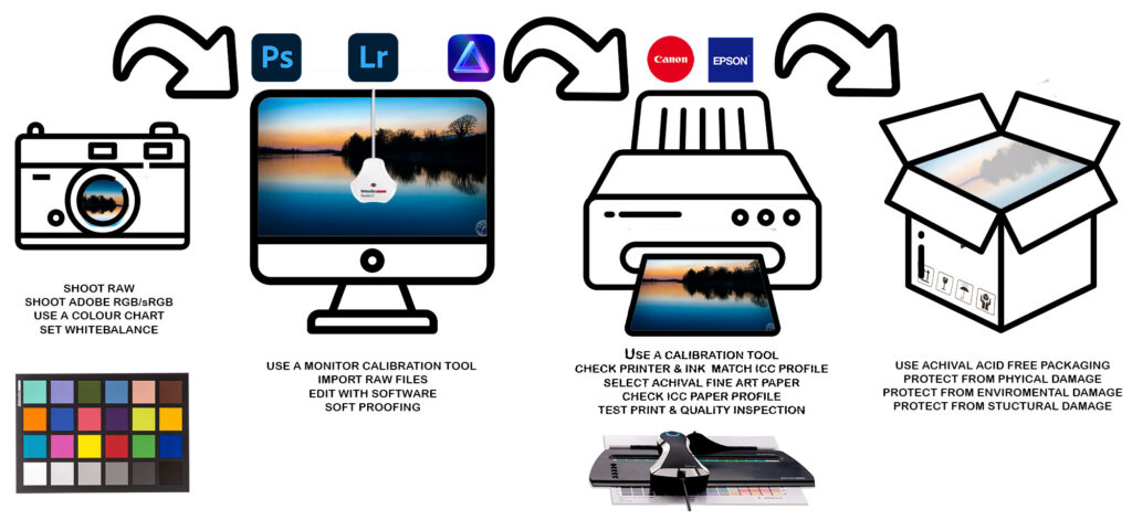
Here is a general overview/methodology of the colour management workflow for fine art photography. By following these steps and maintaining consistency in your colour management workflow, you can achieve accurate and visually appealing fine art prints that closely match your artistic vision.
Calibrate Your Monitor:
Begin by calibrating your computer monitor using a hardware calibration device like the Datacolor Spyder. This ensures that the colours you see on your screen are accurate. Regular calibration is necessary as monitors can shift over time.
Camera Settings:
Set your digital camera to the appropriate colour space. Adobe RGB is a common choice for fine art photography as it has a wider colour gamut compared to sRGB. This allows for more accurate representation of colours.
Raw Capture:
If possible, shoot in RAW format rather than JPEG. RAW files contain more colour information and provide greater flexibility in post processing.
White Balance:
Set the correct white balance in camera or adjust it during post processing. This ensures that the colours in your images are neutral and accurate.
Post Processing:
Import your RAW files into a photo editing software (e.g., Adobe Lightroom, Capture One, Photoshop). Adjust exposure, contrast, and other settings while maintaining accurate colours. Use adjustment layers for non-destructive editing.
Profile Conversion:
Convert your image to the desired colour profile for printing. The most common profile for fine art printing is Adobe RGB. Ensure that the colour profile used in your editing software matches the colour profile of your printer.
Soft Proofing:
Use soft proofing features in your editing software to simulate how the image will appear in print. This helps you identify any potential colour shifts that may occur during the printing process.
Printer Calibration:
Calibrate your printer using a colour calibration tool such as the Datacolor Spyder Print. This ensures that the printer reproduces colours accurately. Printer profiles can be created to match the printer, ink, and paper combination you are using.
Paper Selection:
Choose a high quality, archival paper for printing. Different papers can have varying colour responses, so select one that complements your image. Ensure the chosen paper has a corresponding ICC profile.
Print Test:
Print a small test image to check for colour accuracy, contrast, and overall quality. Make adjustments if necessary, considering factors like brightness, saturation, and colour balance.
Final Print:
Once satisfied with the test print, proceed with the final print. Monitor environmental conditions, such as lighting, as they can affect how the print appears.
Quality Control:
Inspect the final print for any issues, such as colour shifts, artefacts, or printing imperfections. Make adjustments to your workflow if needed.
Conclusions
In conclusion, managing colour in digital photography is a meticulous and essential process that significantly contributes to the overall quality and longevity of fine art prints. The importance of achieving consistent colour results cannot be overstated, and it extends from the initial capture phase to the final print.
Utilising printer manufacturer inks in conjunction with the correct ICC profiles from fine art paper manufacturers is a key element in this colour management workflow. Additionally, regular rechecks of colour calibrations with hardware devices like the Datacolor Spyder and Spyder Print are crucial to maintaining accuracy over time.
Consistency in colour results is paramount for several compelling reasons. Firstly, it ensures that the artist’s creative intent is faithfully represented in the final print. Whether vibrant and bold or subtle and muted, consistent colour management allows the viewer to experience the image as the photographer intended. This fidelity to the original vision is a fundamental aspect of the artistic process.
Moreover, consistent colour results enhance the professional reputation of photographers and fine art printmakers. It establishes a level of reliability and quality that is appreciated by clients, galleries, and collectors. The ability to consistently deliver accurate and pleasing colour reproduction demonstrates a commitment to craftsmanship and attention to detail, reinforcing trust in the artist’s work.
Regular rechecking of colour calibrations is not a one-time task but an ongoing commitment to maintaining the integrity of the colour management workflow. Monitors, printers, and environmental conditions can change over time, impacting colour accuracy. Periodic recalibrations help to identify and rectify any deviations, thereby sustaining the consistency and reliability of the colour management system.
The rewards of proper colour management are multifold. Beyond the satisfaction of seeing one’s artistic vision accurately reproduced, there are tangible benefits in terms of professional recognition, client satisfaction, and marketability. Additionally, the longevity of prints is enhanced when archival practices are employed in colour management, ensuring that the visual impact of the artwork endures over time.
In essence, proper colour management in digital photography is an investment in the quality, integrity, and longevity of fine art prints. The rewards manifest not only in the visual beauty of the prints but also in the enduring reputation of the artist as a creator committed to delivering exceptional and consistent work.
Stephen
Colour Managment - Acronyms
RGB: Red, Green, Blue – The primary colours used in digital imaging.
CMYK: Cyan, Magenta, Yellow, Black – The colour model used in colour printing.
ICC: International Colour Consortium – An organisation that establishes and maintains colour management standards.
ICC Profile: A set of data that characterises a colour input or output device, such as a monitor or printer.
sRGB: Standard Red Green Blue – A standard RGB colour space widely used for digital imaging, web, and consumer electronics.
Adobe RGB: A larger RGB colour space than sRGB, often used in professional photography for a wider gamut.
DNG: Digital Negative – Adobe’s open standard for raw image files.
TIFF: Tagged Image File Format – A versatile file format commonly used for high quality images.
JPEG: Joint Photographic Experts Group – A widely used lossy compression format for digital images.
RAW: Unprocessed and uncompressed image file format containing minimally processed data from the camera sensor.
AWB: Auto White Balance – An automatic setting in cameras to adjust the colour balance based on the lighting conditions.
WP: White Point – The chromaticity coordinates representing the colour of white in an image.
Amazon Affilate Links
https://amzn.to/3tQLHGa spyder x pro
https://amzn.to/48XdvaK spyder checkr
https://amzn.to/421yNSj spyder x2 elite
https://amzn.to/4aZrQFk spyder x2 ultra
https://amzn.to/3S2wh9B Datacolor Spyder X2 Print Studio Kit: Essential photographer toolkit for precise control from recording to editing to print
https://amzn.to/3U2sOuj Datacolor Spyder X2 Photo Studio Kit
https://amzn.to/3tUUJlt Datacolor Spyder Checker Photo for Colour Accuracy & Consistency, Portable Colour Matching Tool with Ergonomic Case, 62 Colour Targets, Colour Correction Chart for Photography & Portraits
https://amzn.to/3SlDS4D datacolor Spyder X Pro: Monitor Calibration designed for serious Photographers and Designers & Datacolor Spyder Checkr24: 24 Colour Patch and Grey Card for camera calibration
This is well written and makes things easier for me. Thank you